The Eric Wroolie Blog

Overpass Experiences

  • Blog
  • Videos
  • Overpass Apps

Powered by Overpass Apps

Eric Wroolie: Gym Man

September 29, 2009 by wroolie 7 Comments

I’ve always hated going to the gym.  It’s not that I don’t like working out—I just prefer something like running.  Running is easy.  It’s solitary.  You can listen to music and not have to worry about being watched or criticized or anything.

Most of my experience with gyms goes back to my time in the Army.  Every post I was stationed at had a gym that soldiers could freely use in addition to our mandatory physical training.  I would occasionally go for periods of up to a week of regularly gym usage.

Arnold Schwarzenegger Color S-Africa
Creative Commons License photo credit: d_vdm

My memories of the gym are of bulky guys having lengthy conversations about their pecks, their lats, their gloots, whatever.  We shared the gym with soldiers from the infantry divisions.  As a linguist, it was a little unnerving (“Sure, they can kill a guy in a few seconds, but let’s see how quickly they can translate the People’s Daily.”). Just by standing in a gym, you were in danger of one these bulky, self-obsessed, guys tapping you on the should and saying “Spot me?”  So, not wanting to look like I didn’t know what I was doing, I would just grunt “Yeah, okay” and pray that the guys could actually bench press the amounts they were trying to lift.

I can remember working in one of the small controlled machines in the corner of the gym and listening to one guy spotting another on the bench press in the centre of the room—“Yeah Man!  You can do it!  Come on! Come On!  Yeah!  Yeah!”  My sarcasm made me want to mock them, but I wouldn’t dare.  However, if he had said “Eye of the Tiger, man!”, I would not have been able to control myself.

I pretty much stayed away from the gym after that.  I’ve run several 10ks, half-marathons, and marathons—but have stayed out of the gym.

As I get older, though, running is not enough to keep me fit.  I fear myself losing out to the obesity epidemic.  Either I have to exercise more or change my diet.  So, last week I joined the gym.

Joining the gym at 37 is not as easy as I thought it would be.  I wish I could have filled out an online form and just showed up at a time I thought it was empty.  Instead, I had to apply in person.  My big fear was that when I approached the reception desk at the local leisure centre and told them I wanted to join the gym, they would start laughing and say “I should think so!”  But, it was easy.

Once I filled in the paperwork, I had to book a meeting with a trainer to discuss my goals and set up a training plan.  I was nervous about this meeting.  I tried to think of a good answer to the question “So, what do you want to achieve by working out?”  I feel uncomfortable answering this question.  I don’t like bringing attention to areas of my body I’m unhappy with—especially to fit guy in his early twenties.  So my rehearsed answer was “You know, I want to do a little toning and work a little bit on upper body strength.”  But I really wanted to say “I want six-pack abs and I want people to gasp for the right reasons when I take my shirt off at the beach.” The answer I gave seemed to work and I am now set-up with a training plan.

The gym at the leisure centre is nothing like the gyms I used on Army bases.  So far, I’ve been going in the middle of the day and there seem to be mostly older people (older than myself) and no body builders.  I am now set-up with a direct-debit scheme that should keep me motivated to keep using it.  So far, so good.

Eye of the Tiger, man.  Eye of the Tiger!

Filed Under: Army Days, Bumblings, Growing Up Tagged With: Army Days, Gym

Overpass site re-designed.

September 25, 2009 by wroolie 2 Comments

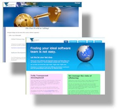
Site ComparisonI’ve been working on redesigning the Overpass website for the past few weeks and have finally put the site live.  I didn’t mind the old site, but it was starting to look old and very 2004.  Website trends change over time and it is easy to tell if a site is not maintained very well.

In the Web 2.0 world, there are certain design principals that are definitely in vogue at the moment.  Sites look cleaner, use few images, adhere more to CSS standards, and have to look good in a mobile device.  A lot more attention is spent these day on where visitors first set their attention when they arrive at your site and how you should optimise it for them.

There is an excellent tutorial on Web 2.0 design created by a company called "Web Design from Scratch” which I found very useful.  That tutorial can be found here.

With the Overpass site, there were some changes I made overall structure to clean it up. 

I reduced the number of pages by about 75%.  It didn’t need to be a book—no one would read it.  By watching the stats on the site for the past few years, I could see that most people didn’t stay very long and did not click on many links.  They might visit one or two pages and stay on the site for about 2 or 3 minutes.  I’m happy with 2 or 3 minutes—but that means I need to condense what is said.

I removed the hierarchical menus in favour of tabs.  I loved the hierarchical drop-down menus when I first started using them.  I’ve been using them in apps for years.  I love that you can add as many new pages as you want without cluttering the interface.  For a financial system, this is fine—but not on a brochure site.  The fewer the pages, the easier it looks for a visitor to swallow with little commitment.

I removed most of the images that added no value.  On the old site, most of them added no value—I just added images to pages that looked too plain.  On the old site landing page, I had an image of a giant key going into a globe on the front page.  Not only was this image very heavy, it took up a lot of real-estate and added no value to the page.  I still have a globe on the new page, but it is more subtle and blends in better with the page.

I’ve made better use of CSS.  I took great pains to make sure the last site was CSS3 compliant, but I tried to use positioning better in this site.  Tables are only used for data, while span and div tags are used for positioning.

I tried to give the site a softer, simpler, feeling.  There are a few things I still am not sure about on the site, but I could tinker with it forever before getting it live if I allowed myself.  I will probably change it more in the future.  This is the third major iteration of this site in the past 6 years, so I’ll try the new design out and see how I like it in a few months.

Filed Under: Software Dev & Productivity Tagged With: CSS, Overpass, Web Design

Expression Superpreview and IE6 transparent PNG images

September 22, 2009 by wroolie Leave a Comment

Up until a few months ago, the best way to ruin a developer pc was to install IE7. 

As much as developers and web designers want the world to move away from IE6, there are still lots of machines that still run it.  These computers are typically in enterprise environments, where staff are prohibited from upgrading their browser and some in-house applications would stop working if they did.  I recently worked in an environment like this.

In the old days (back when all you could see was farmland for miles around), it was easy to load several versions of Netscape and run them concurrently.  I used to be able to code a web page and tell you how it looked in Netscape 3, Netscape 4, Firefox, and . . . whatever version of IE I had installed. 

Because there was no way to install multiple IE versions, you pretty much had to stick with the lowest common denominator—otherwise, there was no way to tell what your site would look like to the luddites.

It was possible to run different browser version in different virtual machines, but this was really tough on a slow pc.  image

Some developers don’t bother checking their code in other browsers at all—especially in a corporate environment, but I encourage it anyway.

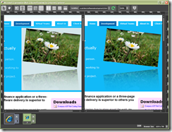
A few months ago, Microsoft released the Expressions Superpreview application which renders your pages in  IE6 and IE7 in a side-by-side comparison.  This really makes life a lot easier.  While working on some changes for the Overpass site, I was able to view my site in Firefox, Safari, and IE8 on my workstation—and in IE6 and IE7 with Superpreview.  I found that my transparent PNG files were not transparent in IE6 and was able to correct this.

Superpreview is one of those tools that would have come in handy so many times in the past.  If you do cross-browser design, you should have a look at it.

The Superpreview application can be downloaded here.

And about the transparent png problem I had (in case you found this post while Googling the issue) . . .

I spent most of the morning and part of yesterday trying to get my transparent png files working.  They worked on the local PC, but not from the server.  I spent ages Googling problems with PNG and Ubuntu, PNG and Apache, etc, but couldn’t find the problem.  In the end, I found that the problem I first had was due to the fact that I was uploading the images as ASCII instead of binary. 

To fix the problem with png transparency rendering in IE6, I used a fantastic script written by Drew Diller called DD_belatedPNG which renders PNG files as VML.  That script can be found here.  What a huge help it was.

Filed Under: Software Dev & Productivity Tagged With: IE6, PNG, Superpreview, Transparency

  • « Previous Page
  • 1
  • …
  • 38
  • 39
  • 40
  • 41
  • 42
  • …
  • 112
  • Next Page »

Recent Posts

  • The Last Human Developer
  • My Gig and the Imposter Syndrome
  • Getting Picked Last for Teams in PE
  • One Little Growth Opportunity at a Time
  • I’m sorry if I look like I know what I’m doing