The Eric Wroolie Blog

Overpass Experiences

  • Blog
  • Videos
  • Overpass Apps

Powered by Overpass Apps

It only takes one error . . .

November 2, 2009 by wroolie 3 Comments

A good developer hates to see an unhandled error in his or her code.  If a user sees an error that tells them what line your code failed at, this is not only a potential security risk but also a major point of embarrassment.  Bad developers think it’s totally acceptable.

I have this kind of argument all the time– “Why don’t you put an error handler here in case the calling code (or user) enters some bad data.”  I get the same response ever time, “But, how often will that actually happen.”  I have this conversations over and over.  The only thing that changes is the person I’m having the conversation with. 

When you’ve coded for lots of different companies, you start to learn how common this is. You have a few very dedicated developers who cater for errors I can’t ever see happening, but you get a lot who are just winging it and stop coding when their work reaches bare functionality.  When you see a news story about how a big site was hacked and all their data compromised, it’s not all that surprising.  A site can look very professional on the outside and be very shaky underneath.

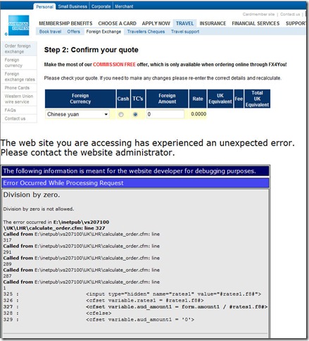
I was trying to order some traveller’s cheques from American Express today.  You may have heard of the company.  I’m sure they spend top dollar for software developers. I’m still not sure what I did to get this (I wasn’t looking for bugs in their software), but I got a big ugly ColdFusion error message:


AmericanExpressError

The error is a standard IIS-delivered unhandled exception error.  I know the lines of code that failed.  I can even click on a link to see a stack trace.  So, you know, I guess it’s embarrassing for the developer (or at least I hope so).  But the bigger issue is that I can’t trust the site any more. 

Somehow, I entered a zero where I should have had a value (and the code is trying to divide by zero), but I honestly don’t know where it was done.

Do you think I’m entering my credit card details after this?  I mean, what else are they not paying attention to?

Actually, it looks like American Express sent me to another site (with AmEx branding) called FX4You.  But still, it reflects badly on American Express.

The ugly truth of software development is that there are loads of standards, but not many of them are adhered to.  Testing always goes out the window to fit delivery deadlines.  Code reviews are non-existent in most organisations I’ve worked with.  The flip-side is that projects loaded with too much bureaucracy frequently fail to see go-live.  There is a happy medium and it is difficult to find.

Back in 2000, when everyone was going crazy about e-Commerce, I was working for a small company looking to build an online shop.  One day, I mentioned that I did not trust most websites with my credit card details, someone started to poke fun at me– “Isn’t it ridiculous that our web developer doesn’t trust buying things on online?”  But, even then, I knew how easy it was to leave security holes open in software.  Just because I took precautions in my code, I knew not everyone else did.  Now it’s almost ten years later and I think most people are more wise to security, but I still would take a site that uses Paypal over a custom-built credit card engine any day.

Maybe I can buy my traveller’s cheques through the American Express site safely, but I won’t risk it.

Filed Under: Software Dev & Productivity

Next, Shanghai and Dalian

November 2, 2009 by wroolie 6 Comments

I went to China for the first time in August (after 20 years of it being the one place I wanted to see more than any other).  That was for a family holiday in Beijing.  I had a fantastic time and was able to practice using Mandarin more than I ever have before.

Next week, I will be in both Shanghai and Dalian for business.  I have several meetings lined up and I am very interested in seeing the up-and-comers in the software development market.

Shanghai is the fastest growing city in the world.  I’m really looking forward to seeing it.  I suppose there will be a lot of construction in preparation for the World Expo next year.

Dalian is a place I’ve been wanting to see for the past few years as it has a vibrant software outsourcing market.

I’m spending a lot of time this week preparing and am really looking forward to the trip.

Exciting times.

Filed Under: China, Chinese, Offshoring, Software Dev & Productivity

Overpass site re-designed.

September 25, 2009 by wroolie 2 Comments

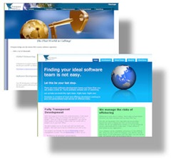
Site ComparisonI’ve been working on redesigning the Overpass website for the past few weeks and have finally put the site live.  I didn’t mind the old site, but it was starting to look old and very 2004.  Website trends change over time and it is easy to tell if a site is not maintained very well.

In the Web 2.0 world, there are certain design principals that are definitely in vogue at the moment.  Sites look cleaner, use few images, adhere more to CSS standards, and have to look good in a mobile device.  A lot more attention is spent these day on where visitors first set their attention when they arrive at your site and how you should optimise it for them.

There is an excellent tutorial on Web 2.0 design created by a company called "Web Design from Scratch” which I found very useful.  That tutorial can be found here.

With the Overpass site, there were some changes I made overall structure to clean it up. 

I reduced the number of pages by about 75%.  It didn’t need to be a book—no one would read it.  By watching the stats on the site for the past few years, I could see that most people didn’t stay very long and did not click on many links.  They might visit one or two pages and stay on the site for about 2 or 3 minutes.  I’m happy with 2 or 3 minutes—but that means I need to condense what is said.

I removed the hierarchical menus in favour of tabs.  I loved the hierarchical drop-down menus when I first started using them.  I’ve been using them in apps for years.  I love that you can add as many new pages as you want without cluttering the interface.  For a financial system, this is fine—but not on a brochure site.  The fewer the pages, the easier it looks for a visitor to swallow with little commitment.

I removed most of the images that added no value.  On the old site, most of them added no value—I just added images to pages that looked too plain.  On the old site landing page, I had an image of a giant key going into a globe on the front page.  Not only was this image very heavy, it took up a lot of real-estate and added no value to the page.  I still have a globe on the new page, but it is more subtle and blends in better with the page.

I’ve made better use of CSS.  I took great pains to make sure the last site was CSS3 compliant, but I tried to use positioning better in this site.  Tables are only used for data, while span and div tags are used for positioning.

I tried to give the site a softer, simpler, feeling.  There are a few things I still am not sure about on the site, but I could tinker with it forever before getting it live if I allowed myself.  I will probably change it more in the future.  This is the third major iteration of this site in the past 6 years, so I’ll try the new design out and see how I like it in a few months.

Filed Under: Software Dev & Productivity Tagged With: CSS, Overpass, Web Design

  • « Previous Page
  • 1
  • …
  • 10
  • 11
  • 12
  • 13
  • 14
  • …
  • 37
  • Next Page »

Recent Posts

  • My Gig and the Imposter Syndrome
  • Getting Picked Last for Teams in PE
  • One Little Growth Opportunity at a Time
  • I’m sorry if I look like I know what I’m doing
  • New Years Reclamations