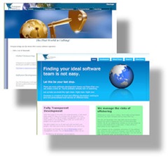
 Iâve been working on redesigning the Overpass website for the past few weeks and have finally put the site live. I didnât mind the old site, but it was starting to look old and very 2004. Website trends change over time and it is easy to tell if a site is not maintained very well.
In the Web 2.0 world, there are certain design principals that are definitely in vogue at the moment. Sites look cleaner, use few images, adhere more to CSS standards, and have to look good in a mobile device. A lot more attention is spent these day on where visitors first set their attention when they arrive at your site and how you should optimise it for them.
There is an excellent tutorial on Web 2.0 design created by a company called "Web Design from Scratchâ which I found very useful. That tutorial can be found here.
With the Overpass site, there were some changes I made overall structure to clean it up.
I reduced the number of pages by about 75%. It didnât need to be a bookâno one would read it. By watching the stats on the site for the past few years, I could see that most people didnât stay very long and did not click on many links. They might visit one or two pages and stay on the site for about 2 or 3 minutes. Iâm happy with 2 or 3 minutesâbut that means I need to condense what is said.
I removed the hierarchical menus in favour of tabs. I loved the hierarchical drop-down menus when I first started using them. Iâve been using them in apps for years. I love that you can add as many new pages as you want without cluttering the interface. For a financial system, this is fineâbut not on a brochure site. The fewer the pages, the easier it looks for a visitor to swallow with little commitment.
I removed most of the images that added no value. On the old site, most of them added no valueâI just added images to pages that looked too plain. On the old site landing page, I had an image of a giant key going into a globe on the front page. Not only was this image very heavy, it took up a lot of real-estate and added no value to the page. I still have a globe on the new page, but it is more subtle and blends in better with the page.
Iâve made better use of CSS. I took great pains to make sure the last site was CSS3 compliant, but I tried to use positioning better in this site. Tables are only used for data, while span and div tags are used for positioning.
I tried to give the site a softer, simpler, feeling. There are a few things I still am not sure about on the site, but I could tinker with it forever before getting it live if I allowed myself. I will probably change it more in the future. This is the third major iteration of this site in the past 6 years, so Iâll try the new design out and see how I like it in a few months.
tori is on fb check her out